Using pd.qcut() Instead of pd.cut() in Data Analysis
This article exlains a situation where pd.qcut(), a quantile cut, is better than pd.cut() during data analysis with python
DATA ANALYTICS BLOG POSTS
Boniface Mibei
4/1/20262 min read

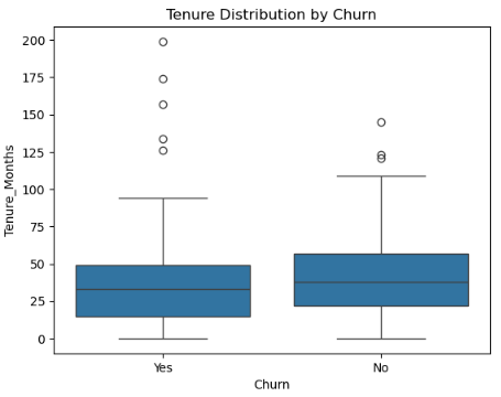
I was recently finding out how Customer Tenure affects Churn Rate. Customer Tenure was a series of numbers that needed to be grouped first. The minimum and maximum values were 0 (zero) and 199, respectively.
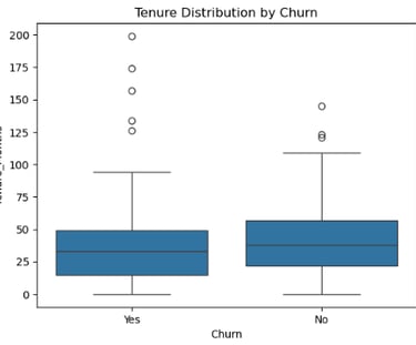
First, I constructed a box plot to understand data distribution, keeping in mind the minimum and maximum values above. The figure was:
Fig. 1: Box plot
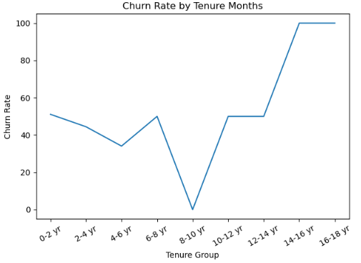
It showed that majority of data are centered around the median value of 25, with the minimum and maximum ones being 0 and 92, respectively. This showed that the data was right-skewed and numbers beyond 92 were outliers. As such, using pd.cut() in grouping and construction of bins would bring a difficult to interpret chart because of unequal data distribution, as shown below:
Fig. 2: Churn Rate by Tenure Group (1)
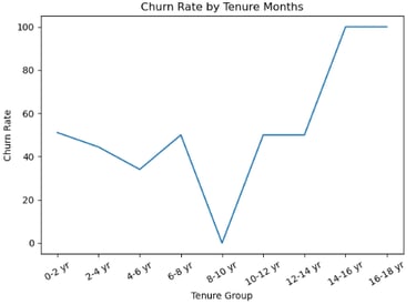
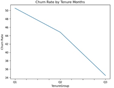
However, using the pd.qcut() function to construct the bins and get three bins would result in a readable and an easy to interpret chart shown below:
Fig. 3: Churn Rate by Tenure Group (2)
This is because the data among the bins were now equally distributed by using the following Python code:
Instead of:
The latter is only applicable with equally or fairly distributed data.
From the figure 3, it can be understood that short term tenure customers have the highest churn rate compared to longer-term tenure ones.
As such, it is upon the business to provide incentives to them for retention and offer benefits for joining longer-term contract periods. This helps in customer retention that increases revenues and profitability for the business.
By:
Boniface Mibei | boniface@bkdataanalytics.com